Building Dashboards in Excel - Part 5 - Slicers
When you create a dashboard, it is essential that you can drill down on your results. With Slicers, you can do so in a visual way!
1) EXCEL AND SLICERS
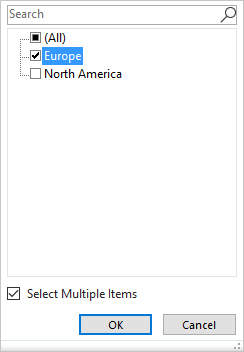
A pivot table is Excel’s most interactive and dynamic feature for analyzing data. One thing which is not so well-incorporated into a pivot table, is the possibility to filter data. The report filter does offer that option, but only indicates that a filter is applied for one or more entries. It does not show which entries! To see which items are applied, you need to open the report filter drop down list, as shown in Figure 1‑1.
Although it does work, it was not considered ideal, so Microsoft had to come up with a better, more visible way to filter pivot table data. The slicer is the answer.
1.1) Slicers - The basics
A slicer is an interactive control with buttons to filter data. A slicer represents a particular field and clearly specifies which item is selected. These are all handy features, but don’t match the best part of a slicer. A slicer can be connected to a single table, multiple pivot tables and multiple pivot charts. This makes the slicer very powerful!
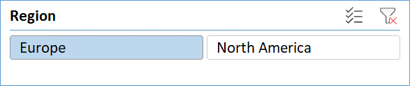
Figure 1‑2 shows a slicer with available regions. When you click on one of the buttons, for instance Europe, the countries that belong to that region will be presented in the table, pivot table, or pivot chart to which the slicer is connected. The slicer itself will clearly indicate that you have selected Europe by showing the other items in a different format!
1.2) Slicers - Creating
You can insert a slicer on a worksheet, but only when a table, pivot table or pivot chart is active. When you do so, you basically connect the slicer to this table, pivot table or pivot chart.
To connect a slicer to a table, follow these steps:
-
- Select any cell within the table
- Select the Table Tools
- Select Tools > Insert Slicer
To connect a slicer to a pivot table or pivot chart, follow these steps:
-
- Select any cell within the pivot table, or pivot chart
- Select the PivotTable Tools, or the PivotChart Tools
- On the Analyze tab, select > Filter > Insert Slicer
After clicking Insert Slicer, the Insert Slicers dialog appears. This dialog contains all the fields from the table, pivot table or pivot chart. Each field represents a slicer.
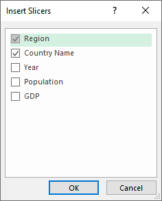
In Figure 1‑3, the slicers for the Region and Country Name fields are selected. When you click OK, these slicers will be placed on the worksheet.
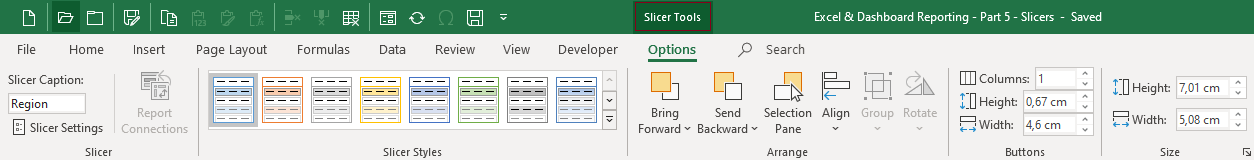
Just as with tables, pivot tables, and pivot charts, a new tab, the Slicer Tools, will appear on the ribbon when you create or select a slicer. The slicer options are divided into five groups of which the Slicer group and Slicer Styles group are the most useful.
You can select multiple slicers to make analyses. In this example, Region and Country Name are selected. Selecting multiple slicers offers more ways to filter your data and adds another feature. Slicers are able to filter other slicers as well!
Consider the situation where you want to filter your data by region and by country name. You therefore need the slicers Region and Country Name. When you filter your data by Region and select Europe, the pivot table and the pivot chart will be updated to only show values for countries belonging to the Europe region.
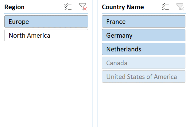
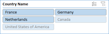
In the example shown in Figure 1‑5, the slicer with items for Country Name is updated as well. It now highlights items that belong to the Europe region. Those available items are dark blue. Non-available items are light blue. These items don’t belong to the Europe region, or are not available for the current selection.
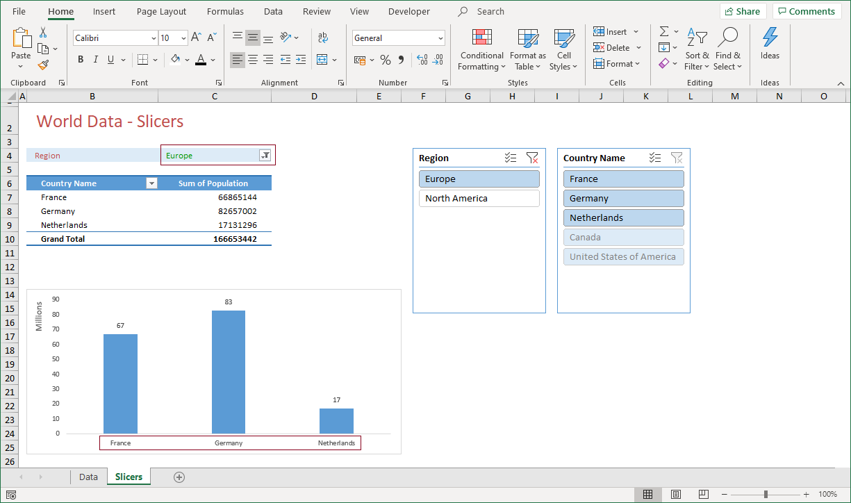
The pivot table and the pivot chart also reflect the changes made to the slicers. Figure 1‑6 is a perfect example.
The Country Name slicer indicates that there are three countries available for the Europe region.
This is also specified by the Filters section of the pivot table which only shows the Europe region. The pivot chart also displays the three countries that belong to the Europe region.
The visual part of a slicer makes it a perfect feature for analyzing data. It is therefore also a perfect instrument to use for building a dashboard!
1.3) Slicers - Modifying
You can modify a slicer or change its properties when it is active. To do so, follow these steps:
-
- Select a slicer, for instance Country Name
- On the ribbon, click Slicer Tools > Options > Slicer > Slicer Settings to display the Slicer Settings pane
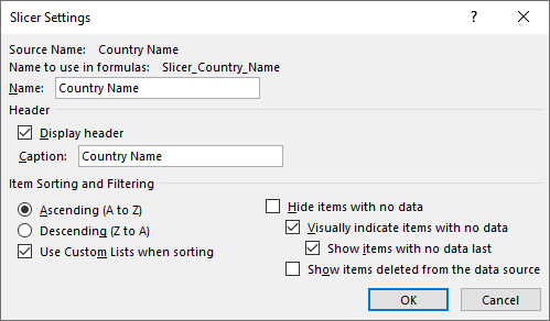
The Slicer Settings pane focuses on how the field is handled. Some features are listed while other features can be modified.
-
- The Source Name is the name of the field in the table or pivot table
- The Name to use in formulas is also predefined. It does what it describes
1.3.1) Settings affecting the slicer
-
- The Name can be changed, but I don’t know why as I haven’t find any features in Excel which are affected when you do so
- You can remove the check in the Display header checkbox. This removes the header from the slicer. I don’t recommend this, as the slicer itself becomes meaningless most of the time
- Caption is the name of the slicer that is displayed in the header. As well as for the previous two features, I can’t find any good reason to change this
The features mentioned above might lead to the conclusion that a slicer is a pretty static thing. The question you might ask is: Are there slicer settings that do make a difference?
The answer is YES!
1.3.2) Settings affecting the items
-
- The option Item Sorting and Filtering can be modified as well, but the default setting (Ascending A to Z) is the one you’ll be using most often
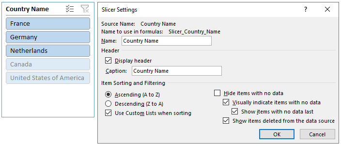
- Hide items with no data offers the opportunity to hide fields which contain no values (for that selection). When you choose to select this option (by adding a check mark), the Country Name slicer depicted in Figure 1‑8, would not show the items Canada and United states of America, as they don’t belong to the Europe region. Subsequently, the check marks at the other three options below would be grayed out
- The options Visually indicate items with no data and Show items with no data last, can best be used together, as is done by default. The slicer will look as in Figure 1‑8. When you choose to not visually indicate items with no data, the check mark at Show items with no data last, will also be removed. Additionally, the slicer items will all have the same button color
-
- Show items deleted from the data source is a feature which is no feature at all. I can’t think of a single reason why you would still show an item that does not exist anymore. Therefore, uncheck it!
When you put all this together, it might be best to make the following choices:

1.3.3) Settings affecting the format
You may not like the default slicer style. If so, you can modify the slicer style by performing the following steps:
-
- Select the slicer
- Click Slicer Tools > Options
Click the down arrow in the Slicer Styles menu

After clicking the down arrow, more slicer styles unfold.
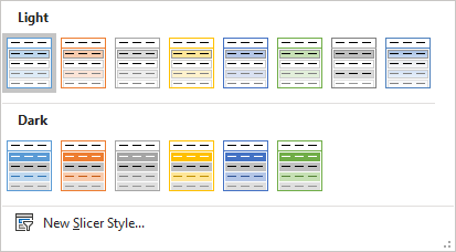
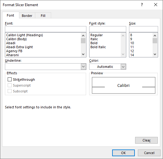
As you can see from Figure 1‑11, there is little to choose from. Fortunately, you can create your own slicer style by clicking New Slicer Style… This brings up the New Slicer Style dialog.
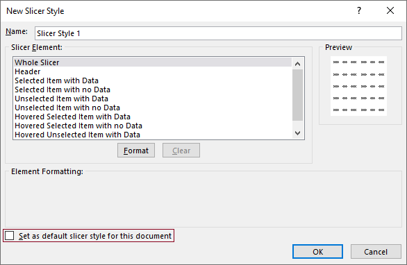
You can create your own slicer style by selecting a slicer element and clicking the Format button. The Format Slicer Element dialog that appears is a smaller version of the normal Format Cells dialog. Putting a check mark at Set as default slicer style for this document, makes the newly added slicer style the default.
1.3.4) Settings affecting the buttons
The buttons on the slicer are what make the slicer such a great tool. By default, the slicer has one column of items. If necessary, you can create any number of columns you like.
-
- Select the slicer
- Click Slicer Tools > Options
Enter a number at Columns in the Buttons group (for instance 2)
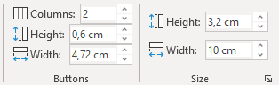
The height and width of all buttons will be adjusted to fit on the slicer, which now has two columns. When you add columns to the slicer, the slicer won’t adjust in size automatically to make the button text readable. You must do that by modifying the button height and width, or the slicer size itself. After doing so, the slicer might look like this:
1.4) Slicers - Report connections
One of the best parts of a slicer is the ability to connect it to more than one pivot table. In practice, this means that you are able to filter multiple pivot tables with one slicer. You can simply connect a slicer to one or more pivot tables.
-
- Select the slicer
- Click Slicer Tools > Options
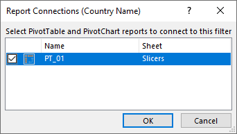
- Click Slicer > Report Connections
!! A slicer can be connected to a table as well, but not to more than one table!
To connect one or more slicers to a pivot table, put a checkmark in the checkbox for the matching pivot table. The Report Connections pane shown in Figure 1‑16 contains one pivot table which is connected to the Country Name slicer. If the workbook contains more pivot tables, they will be listed in the dialog as well.
You can assign multiple slicers to a single pivot table. When you combine that with the ability to assign a slicer to more than one pivot table, you have the perfect candidate for dashboard reports. As pivot charts can be derived from pivot tables, it is thus possible to update multiple charts by selecting items from multiple slicers.
Now how cool is that!
2) SUMMARY
This chapter is about slicers, a feature with which you can visually filter your data. Visually, as you can easily see which item you have selected and how that affects the underlying data and other slicers.
A slicer is a floating set of buttons which represents all unique items of a single field from a table or a pivot table. One of the best parts of a slicer is that a slicer can be connected to a table, or multiple pivot tables and pivot charts. Even more interesting is the fact that a slicer can also filter other slicers.
Slicers are so simple, but yet so powerful, that I guarantee you that when you start using slicers, you will never use the filter options for a pivot table or a pivot chart again.
The advice is clear though. Spend some time on learning how to use slicers. Once you have learned how to use them, you are ready to build the most flexible dashboards that you will ever build. All in Excel.
——————
This article is an extract from my book From Data 2 Dashboard in a Day. This book covers many more tools, tips and tricks about data that you use for dashboard reporting with Excel. You can purchase your copy here or see a preview in the book shop.