Building Dashboards in Excel - Part 4 - Pivot Charts
When you create reports or analyses, you will eventually get to the point where you have to present results. Excel-wise, you can choose between a pivot table and a couple of charts to show the outcome.
1) EXCEL AND PIVOT CHARTS
While pivot tables are fine and very interactive, it can sometimes be very hard to see the bigger picture. When you have a lot of complex data that includes text and numbers, some key points of an analysis may not be clear. Charts, on the other hand, visualize data and make it more understandable.
The downside of a chart is that it is not interactive, so wouldn’t it be nice if you could use something that combines the features from both tools?
1.1) Pivot Charts - The basics
Excel has a tool that combines all the interactive features of a pivot table with the visual characteristics of a chart. It is called a pivot chart. A pivot chart looks like a normal chart, but has far more functionalities. It is based upon a pivot table and has the ability to show numerous analyses by dragging the pivot chart fields to one of the four areas of the pivot chart field list. The extra functionality is represented by the pivot chart fields which, like controls, are embedded as buttons on the chart.
Just like a pivot table, a pivot chart has some requirements. A proper design of the underlying database is absolutely crucial to its success, so it is wise to keep the following rules for that database, preferably an Excel table, in mind:
-
- Use a clear description for each field on the header row (the first row)
- Always use only one row as the header row
- Don’t create empty rows (records) and columns (fields); it splits the database
- Design fields in such a way that each individual entry has the same format
- Sort the database in a logical order
When you want to be flexible, you should set up a reference to a table instead of a reference to a range.
1.2) Pivot Charts - Creating
You can create a pivot chart with a few mouse clicks.
-
- Select any cell within the Table
- From the ribbon, choose Insert >
- PivotChart > PivotChart
- PivotChart > PivotChart & PivotTable
As you can see, there are two options to choose from. Both options insert a pivot chart.
– Choose Insert > PivotChart > PivotChart when you want to create the pivot chart from a pivot table by selecting a cell inside a pivot table. As you already have a pivot table, the second option is greyed-out.
– Choose Insert > PivotChart > PivotChart & PivotTable when you don’t have a pivot table, and want to create the pivot chart directly from your table. Because the pivot chart is derived from a pivot table, the pivot table will be created as well.
When you choose the first option, the Create PivotChart dialog pops up. This dialog is the same as the Create PivotTable dialog and the choices shown in Figure 1‑1, are the choices you will probably make most often.
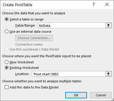
At the bottom of the dialog, you can choose to Add this data to a Data Model. This option is available from Office 2013 onwards and gives you the opportunity to link tables and create a relational database. I will discuss this option in another article.
-
- There is another, fast way to create a pivot chart. Select any cell within a pivot table and press F11. This creates a pivot chart on a new worksheet!
Filling in the Create PivotChart dialog like in Figure 1‑1, will create a pivot chart from a table (tblData). Now mind the tricky part! From the dialog, you learn that the pivot chart will be placed in cell B5, but that is not correct. It is the pivot table that will be attached to cell B5 on the existing worksheet. The pivot chart will float above!
Once you click OK, the pivot chart frame appears on the worksheet, together with the pivot table frame. The result might look like the chart depicted below.

Just as with a pivot table, a couple of new tabs, the PivotChart Tools, will appear on the ribbon when you select the pivot chart. Figure 1‑2 shows the Analyze, Design and Format tabs, from which you can pick options to customize the PivotChart.
The Analyze tab is the most significant tab, as it contains all the tools that you can use to modify your view. The section Show/Hide is worth mentioning, as this section contains tools that make the difference between a normal chart and a pivot chart.
With the Field List, you can create your analysis and with the Field Buttons, which act as filters, you can zoom in on that analysis.
The next step in creating a pivot chart is equal to the way a pivot table is set up. To create a report, you should drag the table fields to one of the four pivot chart areas.
-
- FILTERS The page orientation for a pivot chart. You can choose one item, multiple items, or all items in a page field at one time
- COLUMS Each item in this field occupies a column on the worksheet
- ROWS Each item in this field occupies a row on the worksheet
- VALUES The part of the pivot chart that displays the data. Excel offers many ways to summarize the data (sum, average, count)
- To create a more detailed analysis, you can drop multiple fields in all areas.
In this example, the idea is to show the Country population, grouped by Region. To get this view, follow these steps:
-
- A) Drag the Region field to the Filters section
- B) Drag the Country Name field to the Rows section
- C) Drag the Population field to the Values section
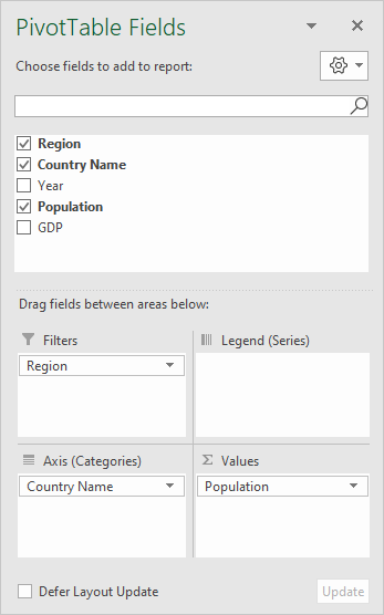
When you have a large dataset, it takes time to update the pivot chart when you add, change, or remove a field from the PivotTable Fields list. When you check the Defer Layout Update option, the Update button will be enabled, allowing you to update a pivot chart after you have made your changes. This may speed up recalculation of everything in the workbook considerably!
The result of dragging the table fields to the four sections of the PivotChart Fields list is a pivot chart that should look like the one in Figure 1‑4.
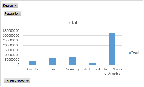
The fact that the chart is a pivot chart, is indicated by the table field buttons embedded in the chart. The Region and Country Name buttons, indicated by the black dropdown arrows, act as filters. Clicking the dropdown arrow opens a normal filter menu. The Population button won’t trigger anything. It serves just as an indicator.

1.3) Pivot Charts - Modifying
The pivot chart layout shown in Figure 1‑4 is decent, but could be better. Fortunately, all elements of a pivot chart can be modified. In general, you can use the Design tab to change the pivot chart structure and the Format tab to change individual chart elements.
In many cases, there are some pivot chart elements that should be improved, for otherwise the pivot chart and its dynamic features will be useless.
-
- A) The chart location
- B) The way values are displayed on the axis (they need adjustment)
- C) The legend (it takes up unnecessary space)
- D) The Values and Country Name buttons don’t add anything to the dynamics of the pivot chart
- E) The label values are missing
In addition to these modifications, there are some other parts of the pivot chart that might be changed. I consider those additional modifications.
1.3.1) Pivot Charts - Modifying the Chart Location
When you are building dashboards, you don’t want the chart to be placed over your data. You want the chart on a separate worksheet where other charts and elements together form the dashboard. Select the Design tab from the PivotChart Tools, click Location > Move Chart to display the Move Chart dialog. Choose Object in and select the worksheet name to move the chart to a new location. In this case Pivot chart worksheet.

1.3.2) Pivot Charts - Modifying the Chart Type
If you must change the chart type, choose Type > Change Chart Type on the Design tab of the PivotChart Tools on the ribbon. When you select Line, for instance, all series in the pivot chart will be displayed as a solid line.
Now, this would be good under most circumstances, but the chart becomes meaningless when the series is displayed as a line. A line suggest some kind of development in time, which is not the case. A better approach would be to choose the Column chart type. Although this will be a matter of perception, it does make the chart more transparent.
To create a column chart, follow these steps.
-
- Select the pivot chart
- Click PivotChart Tools > Tab Design > Type > Change Chart Type to display the Change Chart Type dialog
- Select Clustered Column from the list of chart types
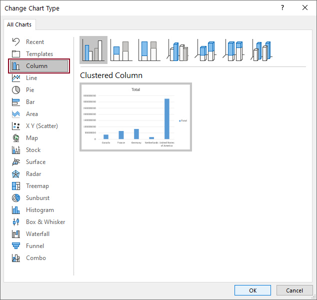
The dialog gives an exact preview of what the chart will look like on the worksheet! When you click OK, the pivot chart will be updated according to the changes that you made.
The Change Chart Type dialog shown in Figure 1‑7 is available from Excel 2016 onwards. It has six extra chart types compared to previous versions of Excel.
-
- Treemap
- Sunburst
- Histogram
- Box & Whisker
- Waterfall
- Funnel)
1.3.3) Pivot Charts - Modifying the Chart Axis
In addition to the chart type and the series dimensions, the number format for the axis also needs adjustment, as 35 with a lot of zeros is not that easy to interpret!
You can change the scale and formats of the axis with a few mouse clicks.
-
- 1) Select the pivot chart
- 2) Select the Vertical (Value) Axis
- 3) Select PivotChart Tools > Format > Current Selection > Format Selection
You can also perform the following actions, which will lead to the same result.
-
- Double-click on the Vertical (Value) Axis
- Fill in the Format Axis dialog
When you double-click the Vertical (Value) Axis, the Format Axis dialog appears. The dialog is divided into two sections. Axis Options is what this dialog is all about. The Text Options contain the options to change the color and size of lines and text.
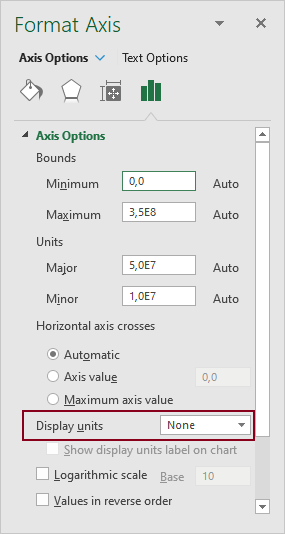
To make the pivot chart axis meaningful, you should adjust the way the scale is displayed. This has nothing to do with the Bounds or Units, as you still need to plot values that will exceed one billion. The trick is to change the way the values are displayed, which can be done by changing the entry for Display units from None to Millions. Figure 1‑8 shows where you can find that option.
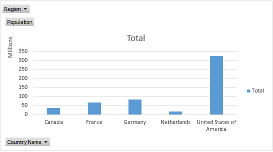
When you do so for the vertical, or Population axis, the pivot chart should look like the one displayed in Figure 1‑9.
1.3.4) Pivot Charts - Modifying the Chart Legend
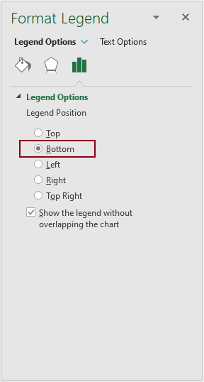
The legend is another part of the pivot chart that should be modified. Its position on the right side of the chart leaves less space for the plot area to display series. To change the position, double-click the legend and select Bottom under Legend Position.
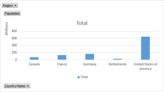
Some charts don’t need a legend. This is certainly true for charts with only one series! In this case, it makes no sense to show the legend, as plotting a unique series requires no additional explanation. Figure 1‑11 shows the legend. You can remove it from the chart by selecting it and pressing the Del (delete) key from your keyboard.
1.3.5) Pivot Charts - Modifying the Field Buttons
The embedded pivot chart Field Buttons are another element that needs adjustment. The Country Name button doesn’t add much to the dynamics of the pivot chart. The Region button may act as a filter, but, as this pivot chart only has a few entries, even that button could be deleted from the pivot chart.
To remove one or more embedded Field Buttons, follow these steps:
-
- Select the pivot chart
- Choose PivotChart Tools > Analyze > Show/Hide
- Click the down arrow on Field Buttons
Doing so displays the Show/Hide Field Buttons options. In most cases it is a good idea to hide all of the field buttons!
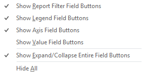
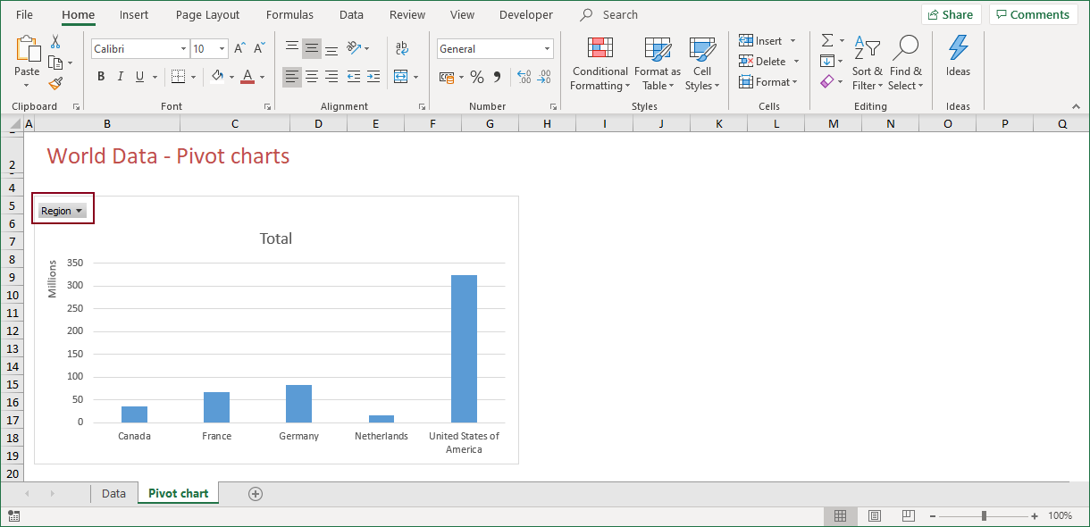
It seems that you have to click the Field Buttons icon on the ribbon each time you want to select or deselect a Field Button, unless you select Hide All. Fortunately, you can also click the filter icon, just above the text Field Buttons. The filter icon serves as a switch, to show or hide all field buttons. In the end, if only the Show Report Filter Field Buttons is selected, the pivot chart will look like the one depicted below.
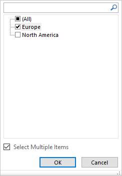
The Region Field Button represents the dynamic part of a pivot chart. When you click the button, a filter appears. This allows you to focus on the regions and see more details of the individual entries. This report filter works just as a normal filter. When you select an item from the list, the pivot chart will be updated after you click OK. Check the option Select Multiple Items, so that you can easily select more than one entry.
Selecting Europe for instance, updates the pivot chart like this:

As you can see in Figure 1‑15, only the values for countries belonging to Europe are plotted on the chart. From the series only, it might be hard to see whether a selection has been made. The fact that the Region Button shows a filter icon indicates that a selection is active!
1.3.6) Pivot Charts - Modifying the Chart Series Names
Although it is a minor detail, it is also worth it to modify the chart series names. When you create a pivot chart (with a pivot table), the series will have a default name. In this case Sum of Population. This name comes from the pivot table.
You can change the name by changing the individual pivot table field settings. Refer to the article about pivot tables to learn how to do so.
1.3.7) Pivot Charts - Additional Modifications
Apart from the previous modifications, there are other elements that can be modified. The question that you should ask yourself is: “What is really needed to tell the tale?”
Do you need a chart title, or does the legend explain what the chart is all about?
Do you need grid lines to give an indication of the population values, or will displaying the actual values by means of a data label be a better alternative?
These are some of the questions you should ask yourself when you are building a dashboard. Maybe it is even better to discuss these issues with your audience. What do they expect?
The last couple of years, the Excel team invested a lot of time in enhancing charts and chart functionalities. They also simplified the process of modifying charts. The same goes for pivot charts.
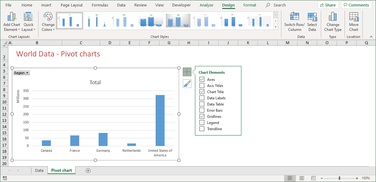
When you select a pivot chart, a plus sign appears next to the pivot chart. When you click this sign, a menu with which you can add many chart elements pops up. It goes without saying that the chart title (Total) does not give any extra information to the meaning of this chart. You can remove the chart title by removing the check mark at Chart Title from this menu.
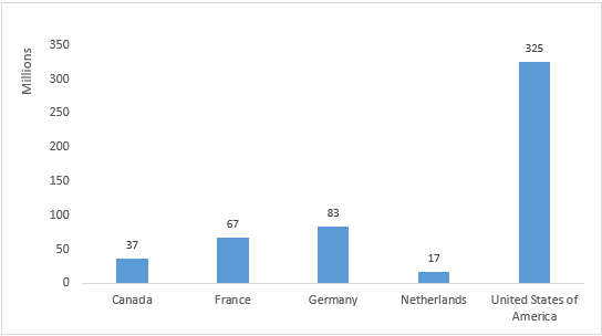
1.3.8) Pivot Charts - Data Labels
Take a closer look at Figure 1‑16. From this chart, the actual population values are not clear. The population of Germany is a little below 100 million. This is nice to know, but a more accurate figure would be better. It is therefore a good idea to display the actual values.
By clicking the plus sign next to the pivot chart and selecting Data Labels, you can achieve this goal. When you do so, the pivot chart will be updated.
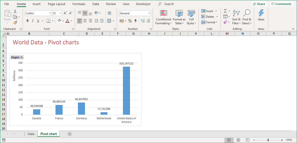
The values in Figure 1‑17 are displayed with a comma as the decimal separator. This is odd as my database does not contain any values with decimals. So why show decimals?
As I decided to display values “as numbers in millions”, Excel had to do some math. The values are recalculated and displayed according to my regional settings. In my case, it means that a comma is shown as a decimal separator.
To modify data labels, double-click any of the values inside the pivot chart. Doing so triggers the Format Data Labels dialog.
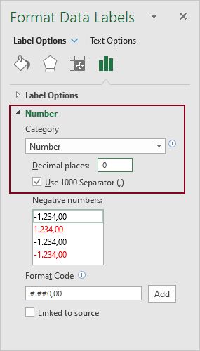
To show data labels as numbers with no decimals, select Number from the dropdown menu under Category and enter a zero (0) for Decimal places.
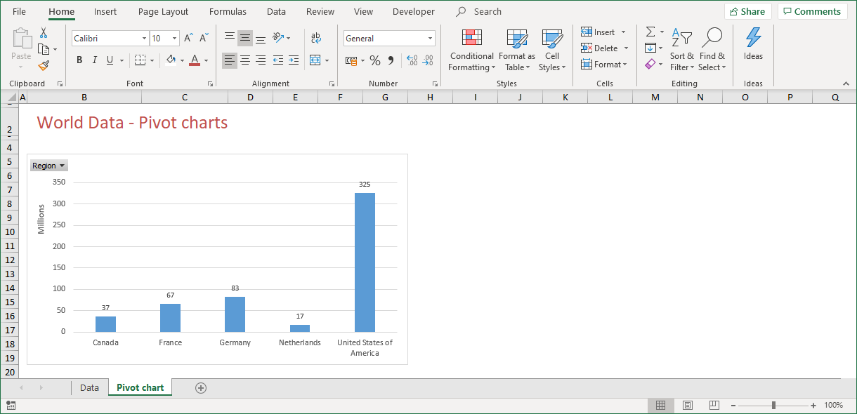
Figure 1‑19 shows the updated chart in which data labels are displayed as numbers with no decimals. In fact, the chart shows numbers that are rounded to the nearest million.
1.3.9) Pivot Charts - Data Label Position
Something else that is worth mentioning, is the position of data labels. In Figure 1‑19, the values for Population are aligned to the top of a data point. Here, with only five data points available, it is easy to see which value belongs to which data point. This will not always be the case, so you might consider changing it.
You can change the position of data labels using the Format Data Labels dialog. Select Label Options > Label Options > Label Position and choose the position you would like.
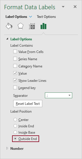
The default choice might not always be the best position. The best way to find out about the best position is, is to try them all. When you select an option, the chart will be updated instantly, showing you the result!
Different Data Series have different Data Label positions! Label positions for a line series are not equal to those of a column series. A line series has the option Above and Below, where a column series has the option Inside Base or Outside End!
When you have a couple of series, it might be unclear which label belongs to which data point. According to the principles of good dashboard design, that should not be the case. Values may never lead to confusion when you plot data on a chart. Plotting multiple series on a chart, is not a good idea. The best choice is to display just one series. That, in my view, should be default for whatever chart you create.
So when you have finally implemented all the changes, the chart might be a chart that looks like the chart that is depicted below.
2) SUMMARY
The combined interactive features of a pivot table and the visual characteristics of a chart make the pivot chart the ultimate tool to visualize data. One or more pivot charts are the key elements of a dashboard, so knowing how to create one and how to design one, is essential when you want to present a clear analysis of your data.
With the good habits of proper dashboard design in mind, it is wise to spend some time on designing your pivot charts. Basically, the idea is that less is more. Many people try to plot too much on a single chart. This may be nice, but it is not always effective. Although a picture may tell a thousand words, the human brain is not able to distinct more than eight different items on a single page. Keep that in mind when you are creating (pivot) charts!
The big benefit of a pivot chart is that it is flexible and dynamic. Just as with a pivot table, a pivot chart has many options to display a subset of the data by using filters. To improve the use of filters, Microsoft recently introduced the concept of a slicer.
A slicer acts as a visual filter. It completes the list of tools that you need to create a dashboard.
——————
This article is an extract from my book From Data 2 Dashboard in a Day. This book covers many more tools, tips and tricks about data that you use for dashboard reporting with Excel. You can purchase your copy here or see a preview in the book shop.