Building Dashboards in Excel - Part 3 - Pivot Tables
When you want to visualize data, you have a good reason to build a dashboard. When you want the end user to be able to dig into various analyses of this data, there is another good reason to build a dashboard. Whatever dashboard you build, the most important requirement is that it is dynamic and flexible. This may seem like rocket science, but you only need a couple of pivot tables to build such an interactive dashboard.
1) EXCEL AND PIVOT TABLES
A pivot table is a handy tool with which you can create numerous analyses of your data. Well-designed pivot tables are the foundation of an Excel dashboard. So, why, when and how should you use pivot tables and what could you use them for?
1.1) Pivot Tables - Why?
When you need to analyze data, Excel offers filters, functions and formulas. Pivot tables are an alternative. Actually, a lot of things that you can do with a pivot table, can be done with built-in functions or a simple filter. So why use a pivot table?
The main reason for using a pivot table is that it offers more flexibility in analyzing data than any other tool. It reduces the possibility of human errors and it increases efficiency when analyzing data. It speeds up many of the tasks that you would normally complete using conventional functions and formulas, because it reduces the amount of keystrokes and mouse clicks needed to get the same result.
Additionally, it organizes and formats data and makes it easy to display that data in one or more charts in various ways. Reasons enough for using use a pivot table!
1.2) Pivot Tables - When?
Even though a pivot table is just one of the tools to analyze data, there are situations where a pivot table is the must-have alternative. A rule of thumb might be to always use a pivot table when you need to:
-
- Analyze large amounts of data
- Create reports on a frequent basis
- Find relationships between data
- Find data trends
- Visualize data (with a dashboard)
1.3) Pivot Tables - How?
Most people use a worksheet range to build a pivot table. From what you have learned about working with data, I consider that to be history. When you want to be flexible, you should set up a reference to a table instead of a reference to a worksheet range.
2) PIVOT TABLES - CREATING
Creating a pivot table takes, contrary to what you might expect, only a few mouse clicks!
-
- Select any cell within a Table
- From the ribbon, choose Insert > PivotTable
- Select your options from the Create PivotTable dialog
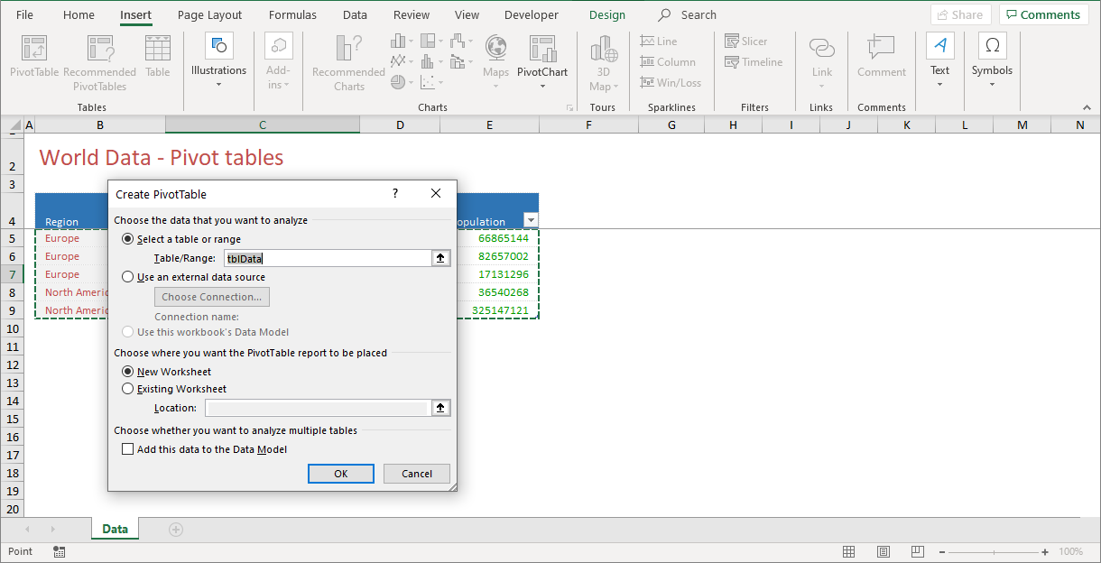
The choices made in Figure 2‑1 are the choices that you will probably make in 95% of the cases. At the bottom of the dialog, you can choose to Add this data to a Data Model. This option is available from Office 2013 onwards and gives you the opportunity to link tables and create a relational database. I will discuss this option in another article.
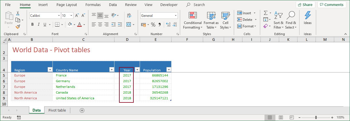
!! The table displayed in Figure 2‑1 is an extract of the much larger original table.
When you click OK, a pivot table frame is added to a new worksheet. When you click inside this pivot table frame, the PivotTable Fields list appears and because a pivot table is now active, the two tabs from the PivotTable Tools, Analyze and Design, appear on the ribbon.
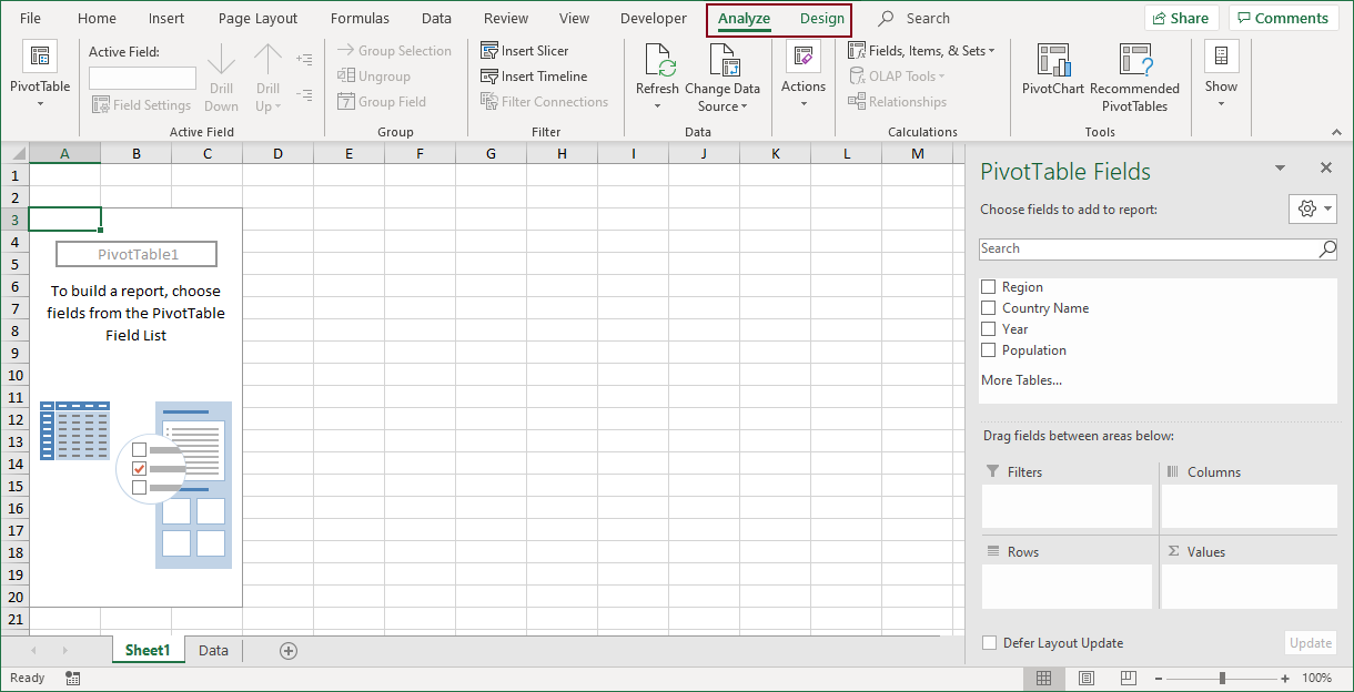
The final step is to create the analysis of your data, the pivot table itself, by dragging the table fields (Country Name, Region, Year, Population) to one of the four PivotTable Fields areas (Filters, Columns, Rows, Values).
By dragging the table fields to one of the areas, or by rearranging a previous layout, you can create almost any analysis that you want. Excel does not have a more flexible tool to do so, but how does it work? How do you know which field goes where?
To answer that question and before you start dropping fields into the PivotTable Fields areas, you should have a clear idea of two things. That which you want to measure and how that should be presented!
2.1) Pivot Tables - Pivot Table Fields
When you want to make any analysis, it is important that you thoroughly understand the basic structure of a pivot table. A pivot table consists of four areas in which you can drop data. The way you do, shapes the appearance of a pivot table.
As you can see from Figure 2‑2, the four sections of a pivot table are Filters, Rows, Columns, and Values. How can you use them?
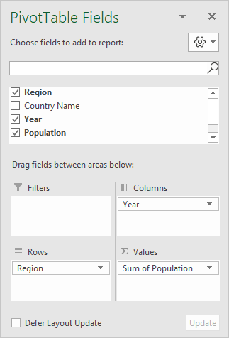
> FILTERS
The FILTERS section of the pivot table fields list is optional. It is very useful when you want to focus on items. For this project you can think of the Region field. A filter gives the option to select one item, multiple items, or all items.
> ROWS
The ROWS section in the pivot table fields list is a good place for data that you want to group or categorize. Any field that you drop into the rows area will show all unique values from that field on the left side of the pivot table. In this project, the Region and Country fields are fields that can be used in the rows area.
> COLUMNS
The COLUMNS section in the pivot table fields list is ideal if you want to display trends or time series in your analysis. Any field that you drop in the columns area will show all unique values from that field from left to right in the top section of the pivot table. The Year field is a good item for the columns area.
> VALUES
The VALUES section of the pivot table fields list, is the section that calculates the data. This section must at least have one field and one calculation. Excel offers many ways to calculate the data, like sum, average or count. In this example, Population is a field that you may use in the values area.
!! To create a more detailed analysis, you can drop multiple fields in all areas.
Let’s take a closer look at what this all means and create a simple pivot table by dropping some data in the pivot table areas.
2.2) Pivot Tables - An analysis
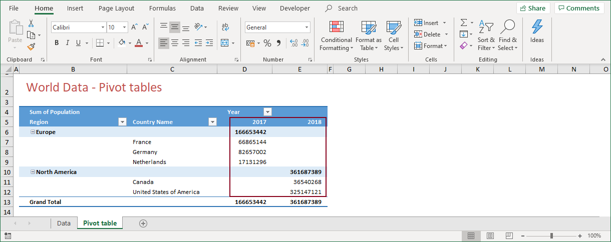
Figure 2‑2 showed the PivotTable Fields list with four fields from the original table. To create an analysis showing the total population by region and year, you should drag the fields to the areas in the PivotTable Fields list as shown in Figure 2‑3.
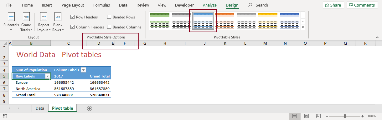
Dragging the fields to the areas in the PivotTable Field list, as shown in Figure 2‑3, results in the following pivot table.

This pivot table is a default pivot table and pretty simple in every instance. It needs some adjustments, as a grand total for columns (adding the populations for one year) does not make a lot of sense.
3) PIVOT TABLES - MODIFYING
Fine tuning a pivot table is easy, as most features can be changed with just a few mouse clicks. So, what are the most essential things to modify?
Here is a list of features that you should consider changing:
-
- The (default) style
- The report layout
- Formatting options
- Empty cells
- Subtotals
- Sorting
- Field Settings and Value Field Settings
3.1) Pivot Tables - Styles
When a pivot table is active, you can change the default style by clicking the Design tab from the PivotTable Tools. In my view, most styles that the style gallery offers look awful, so it is my guess that the first thing you will change, is the pivot table style. The style that I always use is Pivot Style Medium 9. Select this style by clicking PivotTable Styles > Dropdown arrow > Medium 9 on the Design tab.
Also on the Design tab, is the group PivotTable Style Options, with which you can change features like Row Headers and Column Headers.
3.2) Pivot Tables - Report layout
Another crucial part to change, is the report layout. The default layout is Compact Form, which has a few downsides as it does not display the row field names and column field names, as you can see from Figure 3‑2.

As I can’t find any good reason why I should ever do without row field names, I need to change the report layout. This only takes a couple of mouse clicks. When the pivot table is active, first select the Design tab from the PivotTable Tools. Then, click Layout > Report Layout, to display the alternatives.
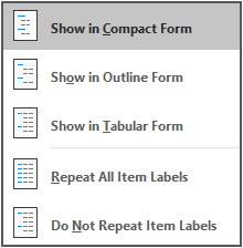
When you click on the Report Layout icon, a small menu appears. This menu offers all options available for designing a pivot table. Apart from the Compact Form, you can select the Outline Form and Tabular Form.
The Outline Form and Tabular Form, in my view, are the better alternatives, but what are the differences between the three layout types?
> COMPACT FORM
-
- 1) Keeps related data from spreading horizontally
- 2) Row labels take up less space, leaving more room for numeric data
- 3) A row label is in a separate row
- 4) Row labels cannot be repeated
- 5) A row field does not show its name in the column heading
- 6) A row field label is always above the labels for the inner fields
- 7) A row label is slightly indented to differentiate the fields
- 8) Subtotals can be shown at the top or bottom of a group
A compact form displays items from row area fields in one column and uses indentation to distinguish between the items from different fields. Row labels take up less space to leave more room for numeric data. Expand and collapse buttons are displayed to show or hide details. A compact form saves space, makes the pivot table more readable and is the default pivot table layout.
> OUTLINE FORM
-
- 1) Items are outlined in a hierarchy across columns
- 2) A row label is in a separate row
- 3) Row labels can be repeated
- 4) A row field shows its name in the column heading
- 5) A row field label is always above the labels for the inner fields
- 6) Subtotals can be displayed at the top or bottom of each group
The outline form displays one column per field and provides space for field headers. It shows subtotals at the top of every group because items in the next column are displayed one row below the current item.
> TABULAR FORM
-
- 1) Row labels for the outer fields are on the same row as the first label for the related inner fields
- 2) Row labels can be repeated
- 3) A row field is in a separate column
- 4) A row field shows its name in the column heading
- 5) Subtotals can only be shown at the bottom of each group
The tabular form displays one column per field and provides space for field headers.
As you can see from the lists, the layouts are almost identical. Basically, the difference is made by the way row labels and subtotals are displayed (or not). To give a better idea of the differences between these layouts, I made copies of the initial pivot table and showed them in an compact, outline and tabular form.
This is the result:
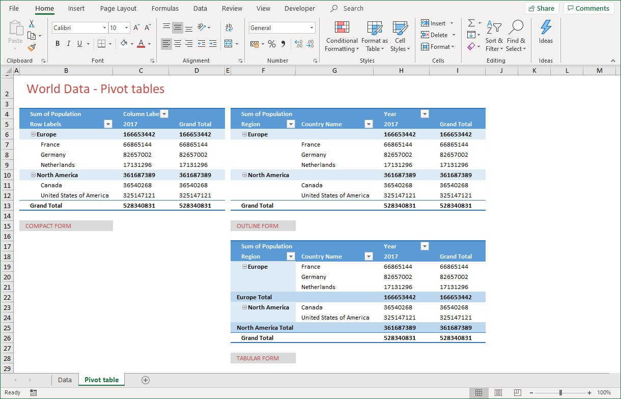
Figure 3‑4 shows the differences between the three pivot table layouts. The compact form is small, but lacks the name of row and column labels. The outline form and the tabular form are more logically organized.
To me, the outline form is the best alternative, as it places subtotals above the individual values. I consider that to be logical as you always want to see the subtotals first, before drilling down to the underlying values.
3.3) Pivot Tables - Formatting options
Very often, users get frustrated after a pivot table refresh. After lots of efforts to create the perfect design, the whole thing goes back to some undescribed preformatted layout. Without a warning! Now why is that?
Maintaining formatting options for a pivot table is a tricky thing. Styles, layout and the way you want totals and subtotals to be displayed are neatly grouped together on the Design tab, but the option to save that design is not there. It is “hidden” in the PivotTable Options dialog.
You can display the PivotTable Options dialog by selecting any cell within the pivot table and clicking PivotTable Tools > Analyze > PivotTable > Options.
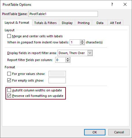
The main reason for frustration comes from a little checkmark that shouldn’t be there. Autofit column widths on update causes columns to resize after a pivot table refresh. In my opinion, it should be unchecked by default, as that is what most people want. Don’t uncheck the option to Preserve cell formatting on update, as this is exactly what you do want!
But that’s not all. Let’s say that you changed the font colors and indented some cells to create your own style. After a refresh, you find that those cell formats are lost! It seems that there is a difference in the way formatting is “attached” to a pivot table. To be more precise, it seems that after a refresh, the formatting of cells via the ribbon is lost, while the formatting of cells through the Format Cells Dialog, is saved. Is this a bug? Probably!
3.4) Pivot Tables - Empty cells
One of the characteristics of good database design is that a field with numerical data shouldn’t have empty cells. Empty means a zero value! Unfortunately, not all datasets store a zero value in an empty cell. Fortunately, Excel offers a solution!
When you want a pivot table to show a zero when the cell is empty, you should do the following. Select any cell within the pivot table and click PivotTable Tools > Analyze > PivotTable > Options. After the PivotTable Options Dialog appears, place a checkmark at For empty cells show: and fill in a 0 (zero).
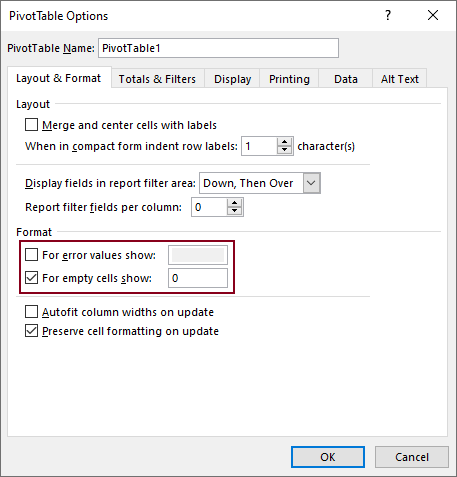
Empty cells do not result in incorrect calculations, but showing a zero value in an empty cell is less confusing and looks better than showing nothing at all.
3.5) Pivot Tables - Subtotals
Subtotals can be added to a pivot table, above or below the data, depending on the report layout. In compact form or in outline form, subtotals can be put above or below the data, but in tabular form, the only alternative is below the data.
Select any cell within the pivot table and click PivotTable Tools > Design > Layout > Subtotals to make your choice.
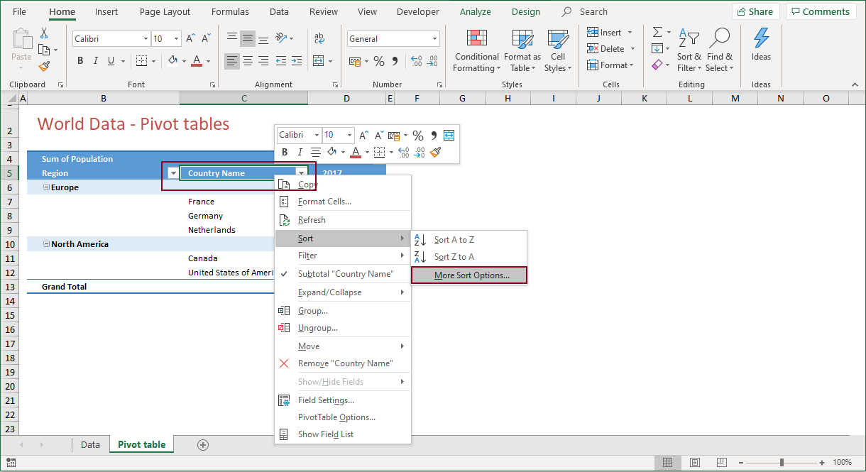
3.6) Pivot Tables - Sorting
Sorting lets you organize data so it’s easier to find the items that you want to analyze. Sometimes, the data in a pivot table is not sorted the way you want, which makes it a little more complex to create analyses. You can easily change this, and more features of the field that you want to analyze, by selecting that specific field, right-clicking on it and selecting Sort, or any of the other options available.
3.7) Pivot Tables - Value Field settings
Despite the efforts to format a pivot table by selecting styles and report layouts, the data is still presented in “general” format. This means no thousands and decimal separators, no currency sign and a default analysis with the name Sum of ….
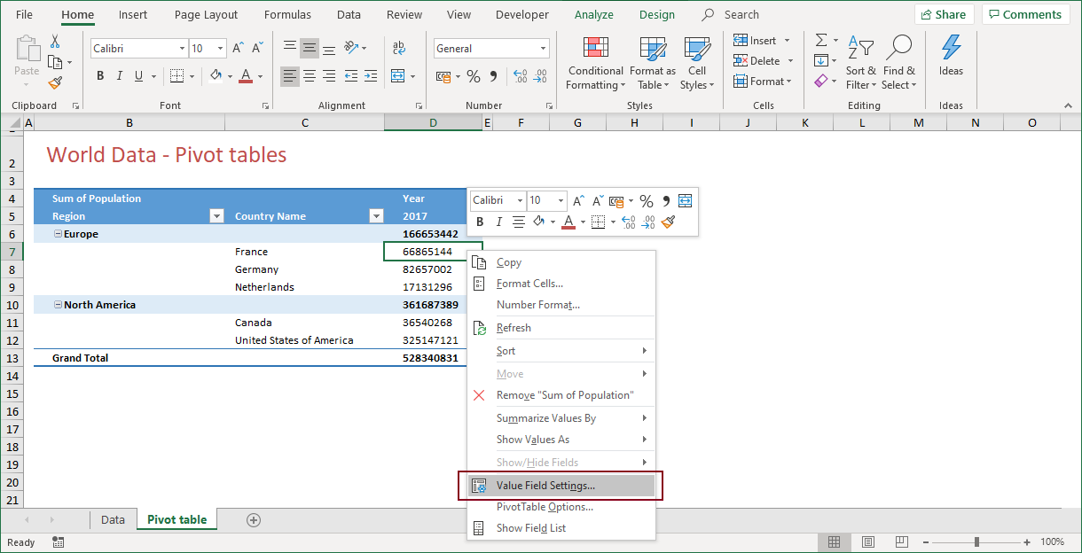
These “value formats” come from the Values section in the pivot table and can easily be changed. In this example by right-clicking the cell Sum of Population and selecting Value Field Settings… When you do so, the Value Field Settings dialog appears.
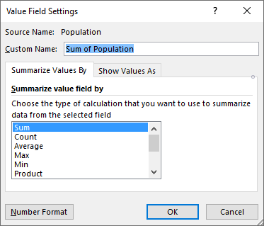
The Value Field Settings dialog offers lots of options for formatting and displaying values of your analysis.
-
- Source Name – The name of the field (Population), used for the analysis
- Custom Name – The (default) name of the analysis. A better name might be Total Population. The name Population is not valid, as this Custom Name may not be equal to one of the field names
- Summarize Value By/Show Values As – The type of calculation
- Number Format – A simplified version of the Format Cells Dialog with just the Number tab
In this case, there is no need to change the number format. As I want this dashboard to be international, the thousands and decimal separators will be confusing for half of the audience!
There is another way to change Value Field Settings. Take a look at Figure 3‑10. When I right-click on one of the population values, I get the following options:
3.8) Pivot Tables - Show values as
As you can see from Figure 3‑10, the option Show Values As appears on the list when you right-click one of the values from the Population field. It offers many other ways to present the actual values.
The first item in the list is No Calculation, but this does not reflect the actual value, which is a percentage of the column total. The additional items are calculations from the actual values. Options like % of Grand Total, Rank, Index and Difference From are really worth finding out what they offer.
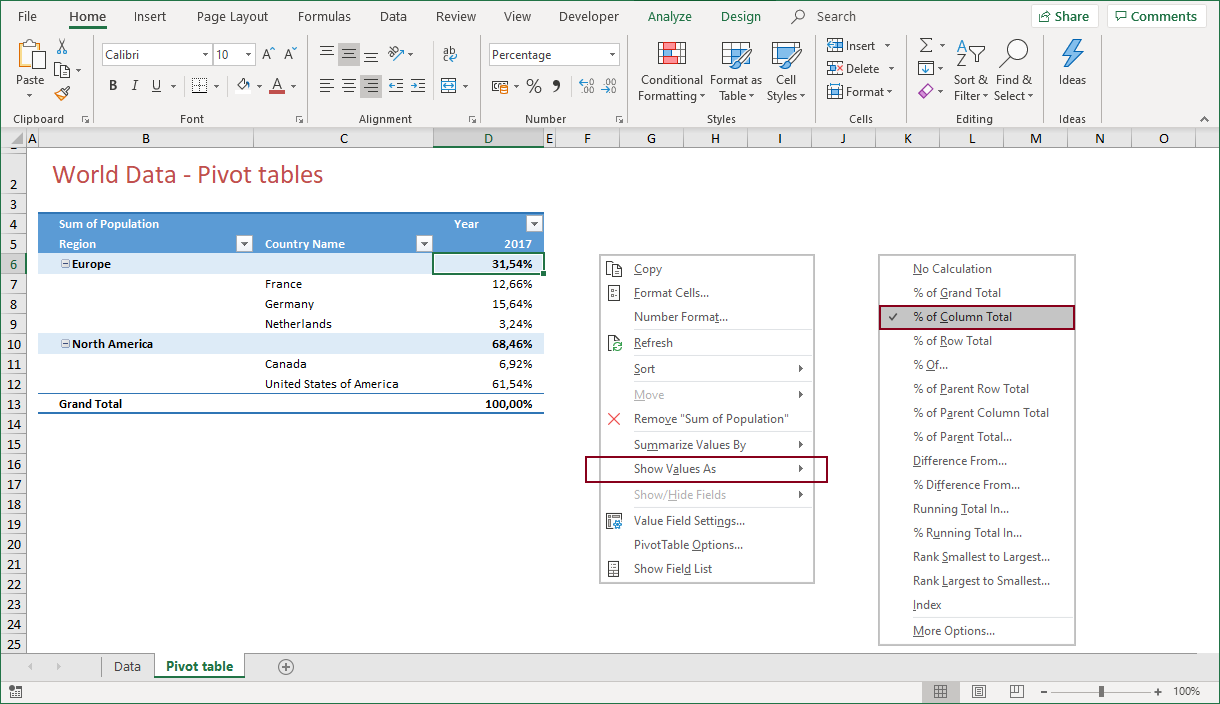
The above figure displays values as a percentage of the column total. This obviously adds up to a 100%.
!! The Index and Rank options are good choices for a dashboard. End users are provided with meaningful information when you show how items relate to each other.
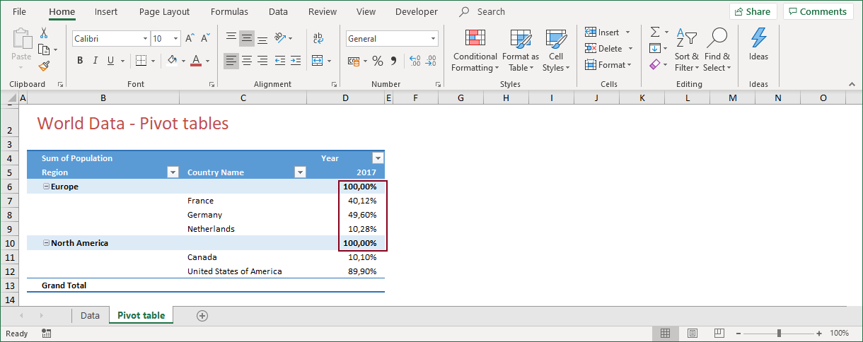
A number of options require some additional steps to be taken. You could for instance choose to show the percentage of the parent total. When you do so, you first have to select a base field. This base field is the parent item and the value is presented as 100%. The underlying items are then divided, to add up to this 100%.
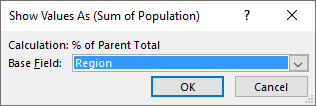
When you choose Region as the base field, the population values of all countries that belong to that region will be presented as a percentage of the value for that region. In this imaginary example, the population of the Netherlands in 2017, is 10% of the total population in Europe!
!! As well as the percentage of … total, the Difference from … and Rank options both use a base field to calculate the actual values.
3.9) Pivot Tables - Field setting
Apart from Value Field Settings, there are Field Settings. These settings apply to fields in the ROW or COLUMN sections of the pivot table. Look again at Figure 3‑10. When I right-click the Region field, I now get these options.

This field comes from the ROW section in the pivot table, so one of the shortcut menu options is Field Settings. It is possible to filter and sort by this field. Also, Expand/Collapse is available, which makes sense, as it is convenient to group countries together and just show the corresponding region.
When you click Field Settings in the right-click menu, the Field Settings dialog pops up. This dialog does not offer many extras for formatting or modifying fields. It merely is a container where the features of the three pivot table layouts are grouped together.
The Subtotals & Filters tab gives you the option to change the name and modify the way subtotals are displayed. Automatic is the default calculation, which you can change when you click Custom and choose any of the other options. Although the option is nice, I don’t see any reason why you should ever change the default calculation.

The second tab is fine for those who want to change the pivot table layout. Although this is nice too, you probably would have done this at an earlier stage, when you made your decision about the compact form, outline form or tabular form layout!
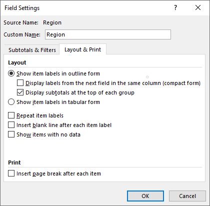
The option to Group and Ungroup seems to be available, but in this case, it is not. When you try to group regions, you get a message that it is not possible to do so!
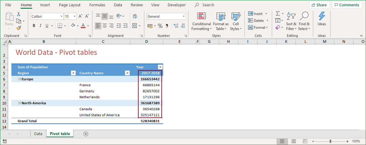
3.10) Pivot Tables - Grouping data
Grouping is a nice feature when you are dealing with date fields. To make things clear, I changed the data source for the pivot table. For the last two records in the table, I changed the value for Year from 2017 to 2018.
When you want to group the data from the table shown in Figure 3‑17 by year, you first have to update the pivot table. When you do so, the pivot table will look like this:
When you choose to group years, you first have to select the Year field. Right click this field en choose Group … from the shortcut menu. The Grouping dialog appears.

By filling in the Grouping dialog, the pivot table will add the data from the individual years. The entries in Figure 3‑19 are correct, except for the 0,1 value in By. Change this to 1 and your pivot table will look like this:
!! You may also group fields other than date fields. Consider a pivot table similar to the one in Figure 3‑20, but without the Region field. Select the countries France, Germany and Netherlands, and click Group. You may wonder why you would need the Region field anyway!
4) PIVOT TABLES - CALCULATED FIELDS
Sometimes a pivot table does not contain all the fields that you need. Many users solve this problem by adding a column to the database and doing the math. Although the outcome might be a field with the desired result, it does involve some threats. Forgetting to add a formula to a new record, or deleting a formula from a specific record are but a few. This is obviously not wat you want and causes the pivot table to show a blank for records that are missing (the result of) that formula.
Some of these issues can be avoided by converting your data into a table. As you have seen in §1.3, a table offers extra features. One of these features decreases the risk of formulas not being copied all the way down to the end of the data set.
But, when you are working with pivot tables, there is a better way to create a “missing” data field. In a pivot table, you can add additional fields which are the result of a calculation. This is what you call a calculated field and the can come in many ways. A calculation may include constants, but can also include existing fields. This makes it a very versatile feature.
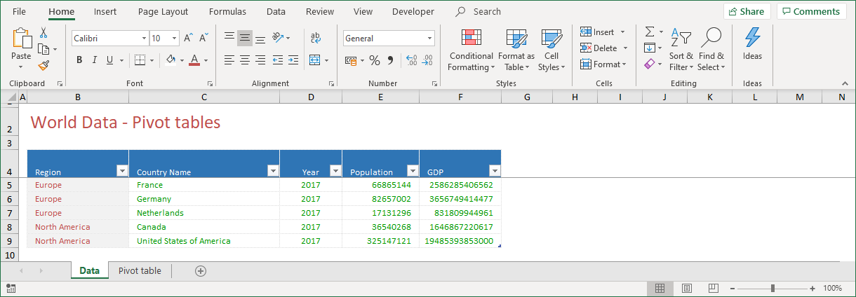
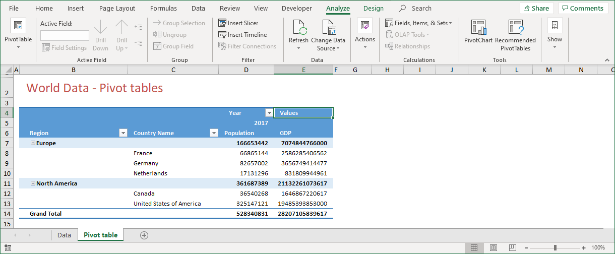
The idea of a calculated field can best be explained with an example. Figure 4‑1 displays the five countries on population and Gross domestic Product (GDP). As countries with a larger population almost always have more to spend, the total GDP does not mean that much. It would be far more interesting to know the GDP per capita, but unfortunately that field is not available.
Before you can display the GDP per capita, you have to create the pivot table. The pivot table to which you want to add the calculated field looks like this:
Once the pivot table is created, you can add the calculated field. A few mouse clicks will do that job.
4.1) Calculated Fields - Creating
To create a calculated field, follow these steps:
-
- Select the pivot table
- From the PivotTable Tools, select the Analyze tab
- Click Fields, Items & Sets from the Calculations group
- Click on Calculated Field …
The last mouse click displays the Insert Calculated Field dialog.
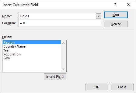
Fill this dialog to create the calculated field.
-
- For Name, type a name for the calculated field, GDP per Capita
- For Formula, type = “GDP”/Population
- Click Add to save the calculated field
- Click OK
- Click Close to close the dialog
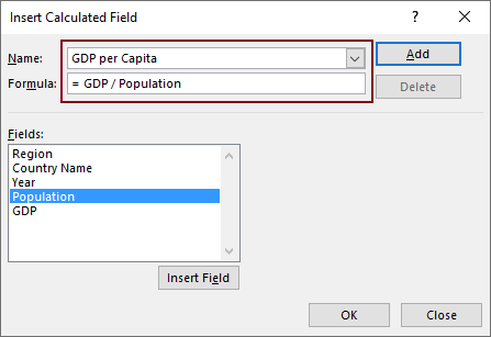
!! You don’t have to type the field names in step two. You can select a field name from the list of Fields, and click Insert Field!
!! When you click Add, the calculated field is added to the pivot table fields list, while the dialog remains open. When you click OK, the same thing happens, but the dialog will close. When you click Close, the dialog will close but the calculated field will not be added to the pivot table fields list. Confusing?
Click OK to add the calculated field to the pivot table fields list.
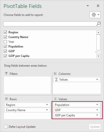
The new, or calculated, field is now available for analysis. In Figure 4‑5, you can see that it has also been added to the VALUES section of the pivot table. When you double- click the Value field “GDP per Capita”, you can change all the settings for this calculated field. When you do so, it may result in the following pivot table:

4.2) Calculated Fields - How it works
Even though a calculated field is the most efficient way to take calculations into a pivot table, they do have some limitations. To fully understand the outcome of their results, it is important to know what goes on behind the scenes.
-
- 1) The only data available for a calculated field, is the data that exists in the pivot table’s internal memory: the pivot table cache
- 2) Calculated fields always apply to the sum of underlying data. This means that individual amounts in all fields are summed before a calculation is performed
- 3) Calculated fields are automatically available in all pivot tables that are based on the same pivot table cache
- 4) Calculated field formulas may contain worksheet functions that accept and return numerical values. This means that COUNT and AVERAGE are valid, but VLOOKUP and INDEX are not
- 5) Calculated field formulas follow the order of operator precedence
4.2.1) The order of operator precedence
A collection of rules that define which procedures to perform first in order to evaluate a mathematical expression. The order of operations used throughout science, technology, mathematics, and computer programming is: exponents and roots, multiplication and division, addition and subtraction.
4.3) Calculated Fields - Limitations
There are some limits to what a calculated field can do. When you create a calculated field, you might expect to see the sum of the calculated amounts in the pivot table’s subtotal and grand total. However, this is not always the case. A calculated field uses the same calculation for the subtotals and the grand total, instead of showing the sum of all the individual records. This means that when a calculated field uses a condition to get a result, things will get unclear as the subtotals and the grand total could be subject to a different calculation than the individual records!
So, keep in mind that:
-
- A calculated field formula can’t refer to the pivot table’s grand total or subtotal
- A calculated field formula can’t refer to worksheet cells by name or by address
- Sum is the only function available for a calculated field
There are two workarounds to overcome the downside of a “miscalculated” subtotal and grand total.
Hide Subtotals and Grand Totals
-
- To turn off Subtotals, right-click the Region field and click Subtotal “Region” to remove the checkmark
- To turn off a Grand Total, right-click the Grand Total label and click Remove Grand Total
Apply a Filter
-
- To hide rows that don’t qualify, filter the field to match the calculation. With the filter applied, the subtotals and grand total are correct
5) SUMMARY
In this article, I discussed the various powerful options of a pivot table. Especially when it comes to data analysis, there is no other Excel tool that will do a better job. A pivot table is the underlying source for a pivot chart, where the pivot chart is one of the key elements for an Excel dashboard. A well-designed pivot table is essential for the story that you want to share and mastering the ins and outs of a pivot table is therefore a must do job!
The best part of creating a pivot table, is that it won’t cost a lot of effort, but that doesn’t mean that creating an effective pivot table is easy. You have to thoroughly understand what your audience wants to know and how you have to present that! This affects the way you design your pivot table(s). Carefully dropping the pivot table fields into one of four the sections of the pivot table fields list, will make a difference.
——————
This article is an extract from my book From Data 2 Dashboard in a Day. This book covers many more tools, tips and tricks about data that you use for dashboard reporting with Excel. You can purchase your copy here or see a preview in the book shop.